Tips for decluttering Visual Studio 2010
Mogens Heller Grabe wrote a nice post about reducing the amount of clutter in your Visual Studio the other day - and I thought I'd chime in with a few tips.
Hiding the Navigation bar
First up we have the navigation bar - which is taking up a line of your precious screen estate.
To remove it, jump to:
Tools -> Options -> Text Editor -> All Languages
Uncheck ‘Navigation bar'. For extra bonus points, check ‘Line numbers'.
Bringing back the Configuration Manager
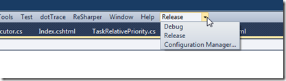
The following tip I got from Rasmus Wulff Jensen when I mentioned that the only thing I really like from the standard Visual Studio toolbars is the ‘Configuration Manager' drop down that allows me to switch between Debug and Release builds. He showed me a neat trick to put it in the top toolbar.
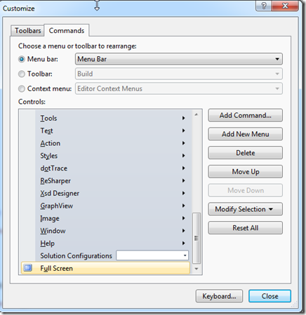
Right click on the tool bar to bring up the tool bar selection.
Choose ‘Customize'. Change the tab to ‘Commands' and move focus to the bottom of the list, like so:
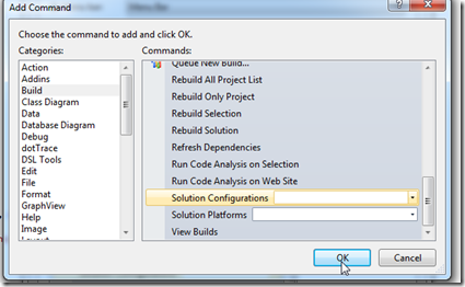
The hit the ‘Add Command' button and go to the ‘Build' category. Scrolling to the bottom, you will find a command labeled ‘Solution Configurations'. Pick it.
You now have an inline configuration manager on your top toolbar without taking up extra space. Same trick can be applied to any other commands.
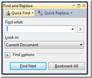
Docking the Find dialog box
The ‘Find and Replace' dialog is probably one of the most used dialogs in Visual Studio - however with the default settings, you get a floating dialog that doesn't seem to want to go away after you're done using it.
If you dock it - like so:
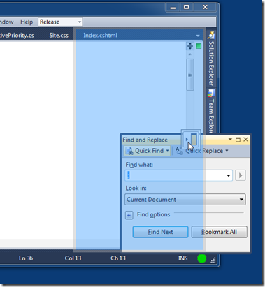
... and unpin it, it will behave nicely and disappear when you're done searching or press ESC.
Switch to a dark theme
This is more a matter of taste. Personally I've been using dark themes for Visual Studio forever. My eyes feel way more relaxed after a day of using a dark theme. My theory is that since computer monitors use additive colors (with white being a full blast mix of red, green and blue and black being no light), a dark theme simply emits way less light.
If you want, you can download my personal theme here (ReSharper specific). It's the same as I've previously posted, except I've adjusted it to work properly with Razor views too.